We are surrounded by brand names and their accompanying logos and logo design. Some have been around for ages, some are relative newcomers to the world of brands.
Your company name and logo help identify your business, organization, or product. Think of the brands that have become commonplace in today’s world—Nike, Mobil, Coca-Cola, the World Wildlife Fund, and thousands more.
These brands have something in common—they’ve survived for generations, have maintained their style, and look relatively unscathed from their original decades-old designs. Others have evolved and look nothing like their predecessors.
Take the Coca-Cola logo as a great example of a design that was originally inked by Frank Mason Robinson and business partner John S. Pemburton in 1885.
Now, more than 130 years later, an updated version of that same logo appears on billions of cans and bottles of the cola.
This cursive script was based on Spencerian Script, a script style that was used in the United States from approximately 1850 through the 1920s and was considered the American de facto standard writing style for business correspondence prior to the widespread adoption of the typewriter.*
Imagine that…a logo that was based on a basic, widely used type style that eventually became one of the strongest brands in the world!
What’s so special about this brand and logo design?
Sure, it’s strong, recognizable, and stylish, but it probably wouldn’t be around today if it wasn’t for the determined marketers and advertising execs who recognized the strengths of the logo and the history behind it. The designers have also been careful in the adaption of modernizing the logo while keeping a close eye to the original.
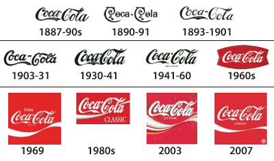
Here’s a look at the logo that shows its progression as it evolved through the years. Not depicted in this image is the rebrand from Coca-Cola to Coke in the ’80s. This coincided with the “New” Coke, which was a flop due more to the change in the formula than the name change.
The logo clearly resembles the original and has maintained that look and feel throughout the life of the brand.
Do I need to change my logo design?
Let’s change gears for a moment and take a look at Coca-Cola’s main competitor, Pepsi.
Pepsi is a brand that is also recognized around the world, but not to the degree that Coca-Cola is recognized. Why is this? It could be that when Pepsi Cola came to the market in 1898, the cursive script logo was too similar to the style of the Coca-Cola logo. The Pepsi logo went through a series of modernizing the script, just as Coca-Cola had. In 1962 Pepsi completely abandoned the “Cola” portion of the name and rebranded to Pepsi using the red, white, and blue color theme that it adopted in 1950 and still uses today.
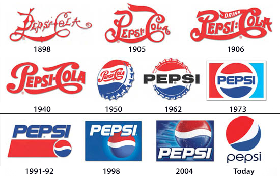
Since 1962, the Pepsi logo has gone through five major redesigns, the latest of which has an icon over the all lowercase Pepsi name. When we look at the latest logo and compare it with the original, there’s no comparison. Despite the radically different approaches to the logo design and the branding, both companies have historically shown sales that have ebbed and flowed in relationship to each other no matter what the logo looked like.
But can you imagine the 1890’s logo of either brand being effective in today’s world? The point is that logos and brand identity are fluid and must reflect changes in business, lifestyle, and audience. So yes, you should change your logo to stay current and to reflect your brand.
Five Key Points for Effective Logo Design
Brand is important. No matter what changes have been made, the Coca-Cola name and brand has evolved, yet retained the flavor of the original.
Pepsi has retained a portion of its 1950s logo and has kept some variation of that as a constant throughout the years. Is one brand doing it right and another wrong? Some brands need a facelift to stay current, others just mild updates.
- Keep it simple
- Keep the design to one or two colors
- Keep busy illustrations out of the design; they aren’t effective when viewed from afar and when used in small scale. Icons are fine
- Use strong fonts. Avoid fonts with thin serifs and overly-ornate fonts
- When possible create alternative logos for horizontal, square, or vertical spaces
Refurbishing and freshening the FirstTracks logo design
FirstTracks opened its doors in October 2009. Our three founding partners had a vision to create great work with an eye to detail, great customer service, and to be a valued partner in the success of our clients.
When we were sitting around the table discussing what we were going to call the company, we wanted a name that meant something to us, had meaning behind it, and had something to do with our mission. Frank Robinson and John Pemburton probably hadn’t putting nearly as much thought into their Coca-Cola logo design.
What did the three founding members of FirstTracks all have in common? We all skied. We enjoyed the thrill of getting out on the slopes on some freshly groomed corduroy-textured snow. We wanted our potential clients to get a message from this as well… we wanted to be first, we wanted to put our clients first and on the right track.
Our first logo design reflected this… we were a bit conservative and used a nice, strong icon that depicted two ski tracks cutting through the snow coupled with a clear, easy-to-read font (Garamond), and combined this with two nice strong blues to complete the logo.
Fast forward to 2014: We decided that we needed to change our logo design to reflect our growth and change. FirstTracks now consisted of two original founders, a new partner, and nine full-time staffers. Our mission was the same, but our growth has been in the web services sector of marketing.

We retained the ski tracks from our original design and added them to a diamond to give the logo a bit more energy. We also split the name to help with readability. Then we opted to change the font to get away from the traditional Garamond and change to a Google font called Play.
These changes combined to give us more of a tech look and feel and to reflect our evolution to more web and digital marketing services. We also wanted a neutral color that would work in almost any environment of media, so a nice PMS 8402 Gray was selected. The logo works well on our site, in email, on cell phones, on business cards and letterhead, and even on shirts.
Does Your Logo Design Need a Facelift or Refresh?
Do you have a new company, organization, or product that needs branding, an update, or refresh? Please reach out and give us a call at 603-924-1978 or fill out our contact form today. We’ll get right back to you to discuss your branding needs and goals.