Why You Need a Brand Style Guide
A brand style guide is essential for enhancing brand recognition, both internally and externally. It ensures that your brand is consistently communicated across all platforms and media, strengthening its identity. Your brand, which could be your company name or a product or service, is what distinguishes you from the competition. Presenting it in a consistent way keeps your brand strong and recognizable.
A brand style guide, also referred to as a brand guideline or brand manual, is a comprehensive document that provides detailed instructions on how a brand should be visually and verbally represented. By adhering to a brand style guide, your brand can establish a distinctive identity, stand out from competitors, and leave a lasting impression on consumers. While the specific content and format of a brand guideline may vary depending on the organization, the following are common elements typically found in such documents:
Logo Guidelines
Your brand style guide should start with a visual representation of your logo, accompanied by a brief explanation of its details and guidelines on when and where to use it. As the centerpiece of your brand, this section delves into the specifics of the logo, including how it should be treated in various scenarios. It should provide examples of correct and incorrect logo usage, such as displaying it on backgrounds with good and poor contrast, and specifying the required space around the logo.
The “Do’s” for the Logo
In this section, you should outline acceptable practices for handling the logo within the brand guidelines. These practices may include:
- keeping the logo visible wherever it is used,
- specifying the permissible size range, and
- offering different color variations for both light and dark backgrounds.
The “Don’ts” for the Logo
Within your brand guidelines, be sure to highlight actions to avoid concerning the logo. This could include:
- restrictions on changing the logo’s colors,
- distorting it through resizing,
- setting a minimum size requirement, and
- establishing a defined amount of space (padding) around the logo to keep it separate from other elements.
Color Palette

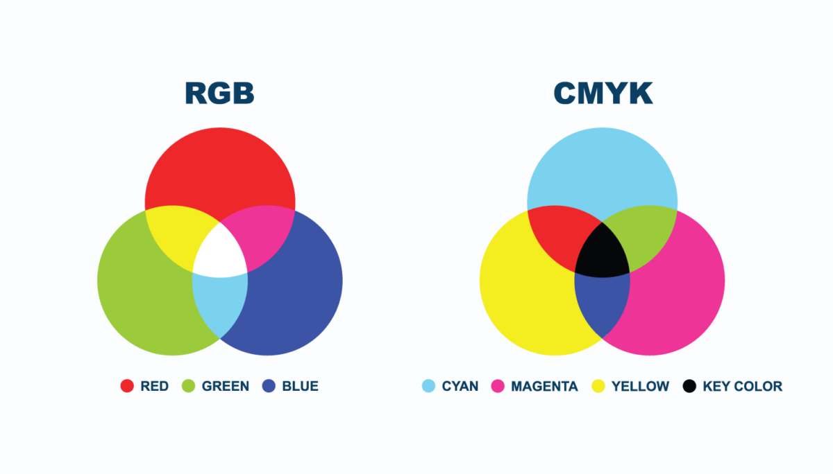
A standardized color palette plays an important role in brand recognition and helps maintain visual consistency across all content. Your color palette should include primary and secondary colors, as well as secondary and neutral shades. It should also include RGB (Red, Green, Blue) color values for digital designs, such as in websites and emails, and CMYK (Cyan, Magenta, Yellow, Key or Black) color values for print materials. Providing this information allows those working with the logo to remain consistent and “on-brand” with the presentation.

Hex Codes
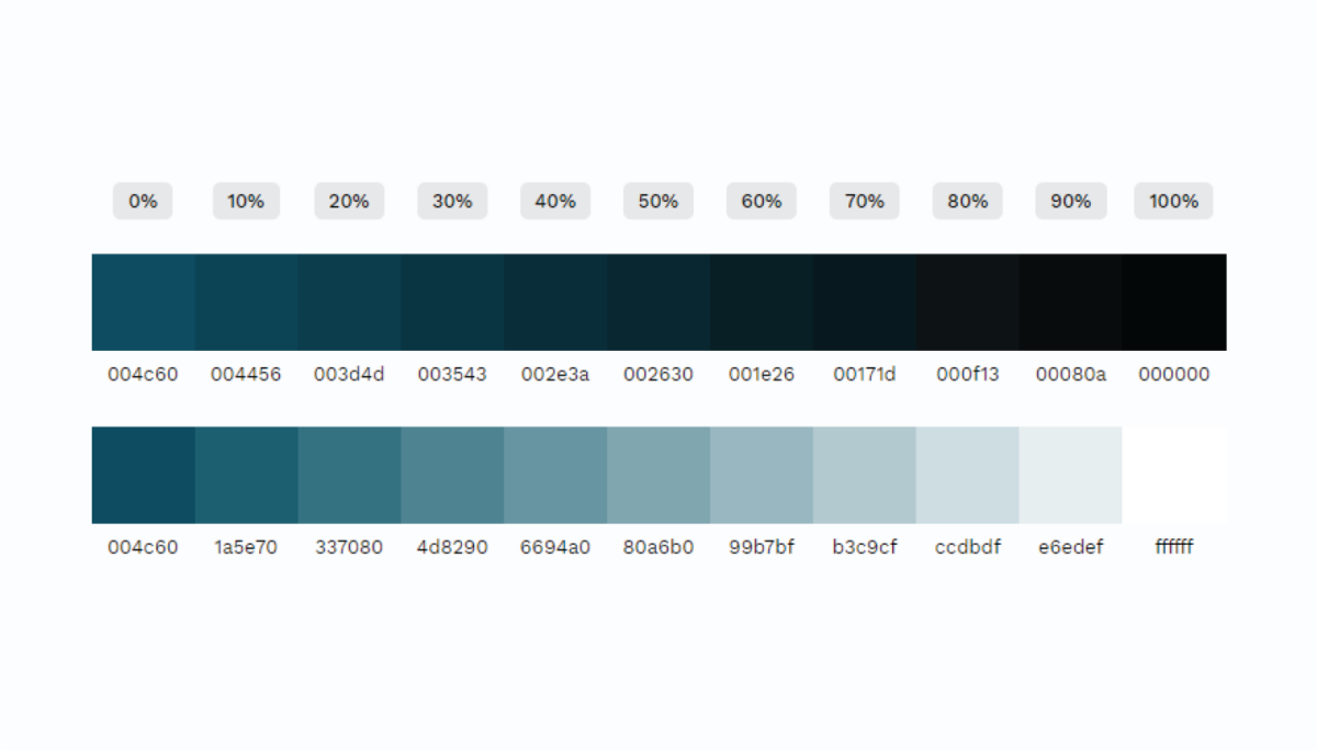
Your guide should also Include hex (hexadecimal) codes for easy reference by designers working on digital materials, such as websites and emails. Hex codes ensure that the exact brand colors are consistently applied in HTML, CSS, and SVG formats.
Tints and Shades
To expand the versatility of your color palette, include tints and shades of the brand’s colors. Free online tools such as the Tints and Shades Generator can quickly create these variations when provided with the hex codes of your colors.

Typography
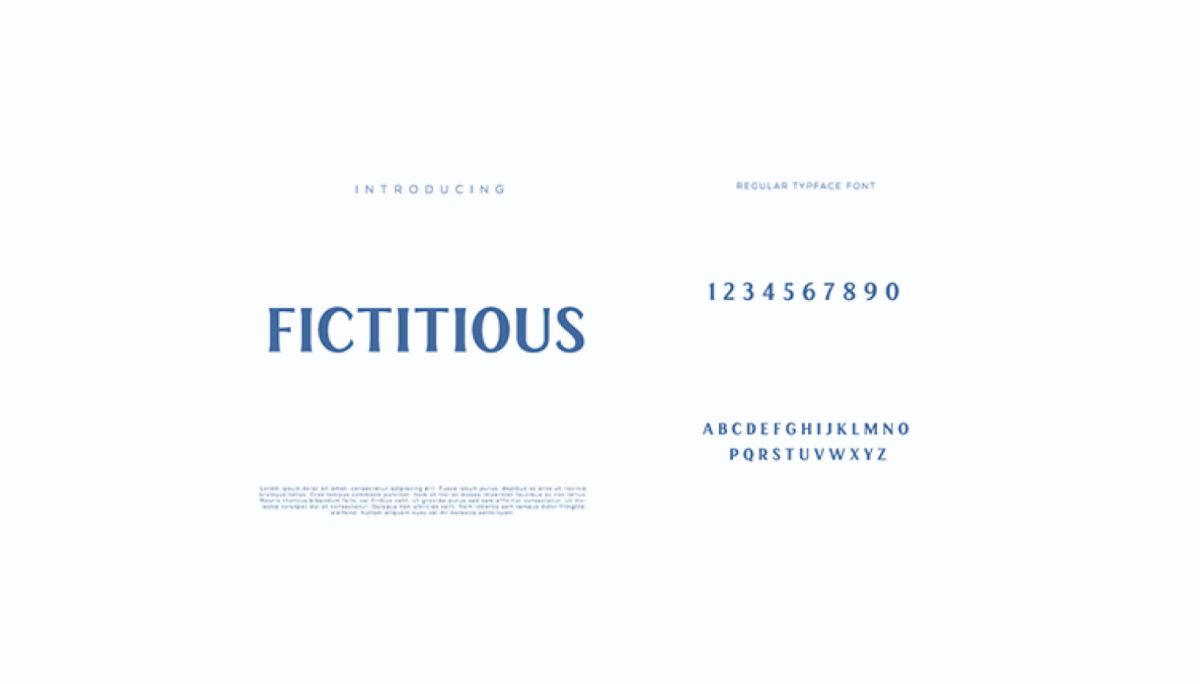
Typography extends beyond the brand or logo font and encompasses the fonts used in website copy, promotional graphics, print materials, and taglines. Your brand guide should include:
- Information about both primary and secondary fonts for headings and titles as well as body copy.
- Examples of font variations, such as bold and italic styles, and define different heading and body copy sizes for each font.
- Default system fonts or web-safe fonts for cases, generally online, where specified fonts are not available.

Imagery and Iconography
Your guidelines should include information about approved imagery, icons, and symbols for use on your company’s website and in print materials. This section can also suggest preferred stock image providers and recommend specific photo styles. Include product shots and images representing your target demographic, and offer examples of approved icons for reference.
Brand Voice
In this section, define your company’s personality and the tone you want to convey, whether it’s friendly and casual, formal and official, or any other style. This guidance will assist content creators in accurately representing your company’s character.
Mockups
This section of your guide should include product packaging mockups, website mockups, and app mockups and how brand imagery should be applied in various contexts. The specific content and level of detail can vary widely depending on your organization’s needs and the complexity of your brand identity. The goal is to provide a comprehensive and clear set of visual guidelines to maintain brand consistency and integrity across all communication channels and materials.

Merchandise
If your company sells branded products, provide examples of how the logo should appear on different merchandise, such as t-shirts or hats.

Conclusion
At FirstTracks Marketing, we are firm believers in expanding the horizons of what is achievable through marketing. So if you need help in developing a brand style guide or are seeking to solidify your brand or logo, reach out to our team at any time. You can Contact Us or check out the different Marketing Services we offer to support your brand’s growth.


